In this vignette, we’ll walk through conducting an analysis of variance (ANOVA) test using infer. ANOVAs are used to analyze differences in group means.
Throughout this vignette, we’ll make use of the gss
dataset supplied by infer, which contains a sample of data from the
General Social Survey. See ?gss for more information on the
variables included and their source. Note that this data (and our
examples on it) are for demonstration purposes only, and will not
necessarily provide accurate estimates unless weighted properly. For
these examples, let’s suppose that this dataset is a representative
sample of a population we want to learn about: American adults. The data
looks like this:
dplyr::glimpse(gss)## Rows: 500
## Columns: 11
## $ year <dbl> 2014, 1994, 1998, 1996, 1994, 1996, 1990, 2016, 2000,…
## $ age <dbl> 36, 34, 24, 42, 31, 32, 48, 36, 30, 33, 21, 30, 38, 4…
## $ sex <fct> male, female, male, male, male, female, female, femal…
## $ college <fct> degree, no degree, degree, no degree, degree, no degr…
## $ partyid <fct> ind, rep, ind, ind, rep, rep, dem, ind, rep, dem, dem…
## $ hompop <dbl> 3, 4, 1, 4, 2, 4, 2, 1, 5, 2, 4, 3, 4, 4, 2, 2, 3, 2,…
## $ hours <dbl> 50, 31, 40, 40, 40, 53, 32, 20, 40, 40, 23, 52, 38, 7…
## $ income <ord> $25000 or more, $20000 - 24999, $25000 or more, $2500…
## $ class <fct> middle class, working class, working class, working c…
## $ finrela <fct> below average, below average, below average, above av…
## $ weight <dbl> 0.8960, 1.0825, 0.5501, 1.0864, 1.0825, 1.0864, 1.062…To carry out an ANOVA, we’ll examine the association between age and
political party affiliation in the United States. The age
variable is a numerical variable measuring the respondents’ age at the
time that the survey was taken, and partyid is a factor
variable with unique values ind, rep, dem, other.
This is what the relationship looks like in the observed data:
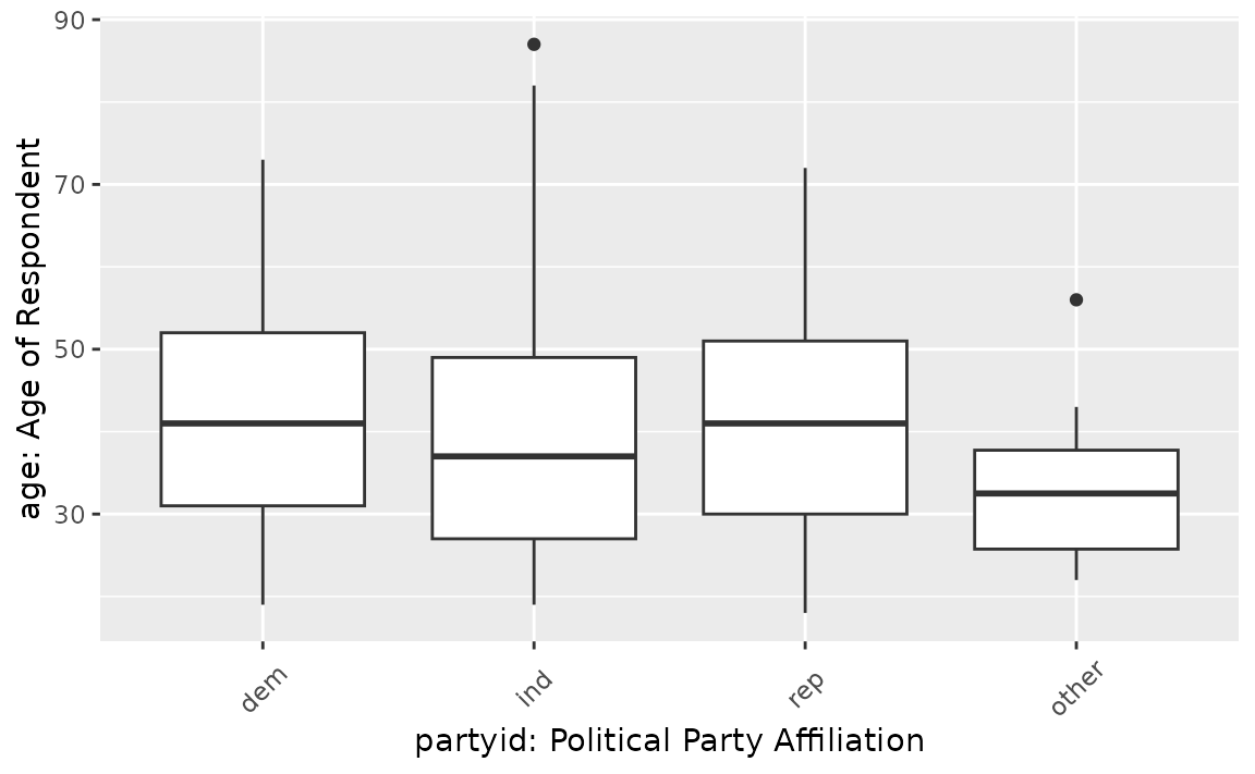
If there were no relationship, we would expect to see the each of these boxplots lining up along the y-axis. It looks like the average age of democrats and republicans seems to be a bit larger than independent and other American voters. Is this difference just random noise, though?
First, to calculate the observed statistic, we can use
specify() and calculate().
# calculate the observed statistic
observed_f_statistic <- gss |>
  specify(age ~ partyid) |>
  hypothesize(null = "independence") |>
  calculate(stat = "F")
The observed statistic is 2.4842. Now, we want to compare this statistic to a null distribution, generated under the assumption that age and political party affiliation are not actually related, to get a sense of how likely it would be for us to see this observed statistic if there were actually no association between the two variables.
We can generate() an approximation of the null
distribution using randomization. The randomization approach permutes
the response and explanatory variables, so that each person’s party
affiliation is matched up with a random age from the sample in order to
break up any association between the two.
# generate the null distribution using randomization
null_dist <- gss |>
  specify(age ~ partyid) |>
  hypothesize(null = "independence") |>
  generate(reps = 1000, type = "permute") |>
  calculate(stat = "F")
Note that, in the line specify(age ~ partyid) above, we
could use the equivalent syntax
specify(response = age, explanatory = partyid).
To get a sense for what this distribution looks like, and where our
observed statistic falls, we can use visualize():
# visualize the null distribution and test statistic!
null_dist |>
  visualize() +
  shade_p_value(observed_f_statistic,
                direction = "greater")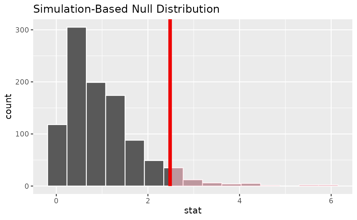
We could also visualize the observed statistic against the
theoretical null distribution. To do so, use the assume()
verb to define a theoretical null distribution and then pass it to
visualize() like a null distribution outputted from
generate() and calculate().
# visualize the theoretical null distribution and test statistic!
null_dist_theory <- gss |>
  specify(age ~ partyid) |>
  assume(distribution = "F")

visualize(null_dist_theory) +
  shade_p_value(observed_f_statistic,
                direction = "greater")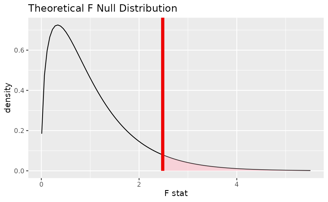
To visualize both the randomization-based and theoretical null
distributions to get a sense of how the two relate, we can pipe the
randomization-based null distribution into visualize(), and
then further provide method = "both" to
visualize().
# visualize both null distributions and the test statistic!
null_dist |>
  visualize(method = "both") +
  shade_p_value(observed_f_statistic,
                direction = "greater")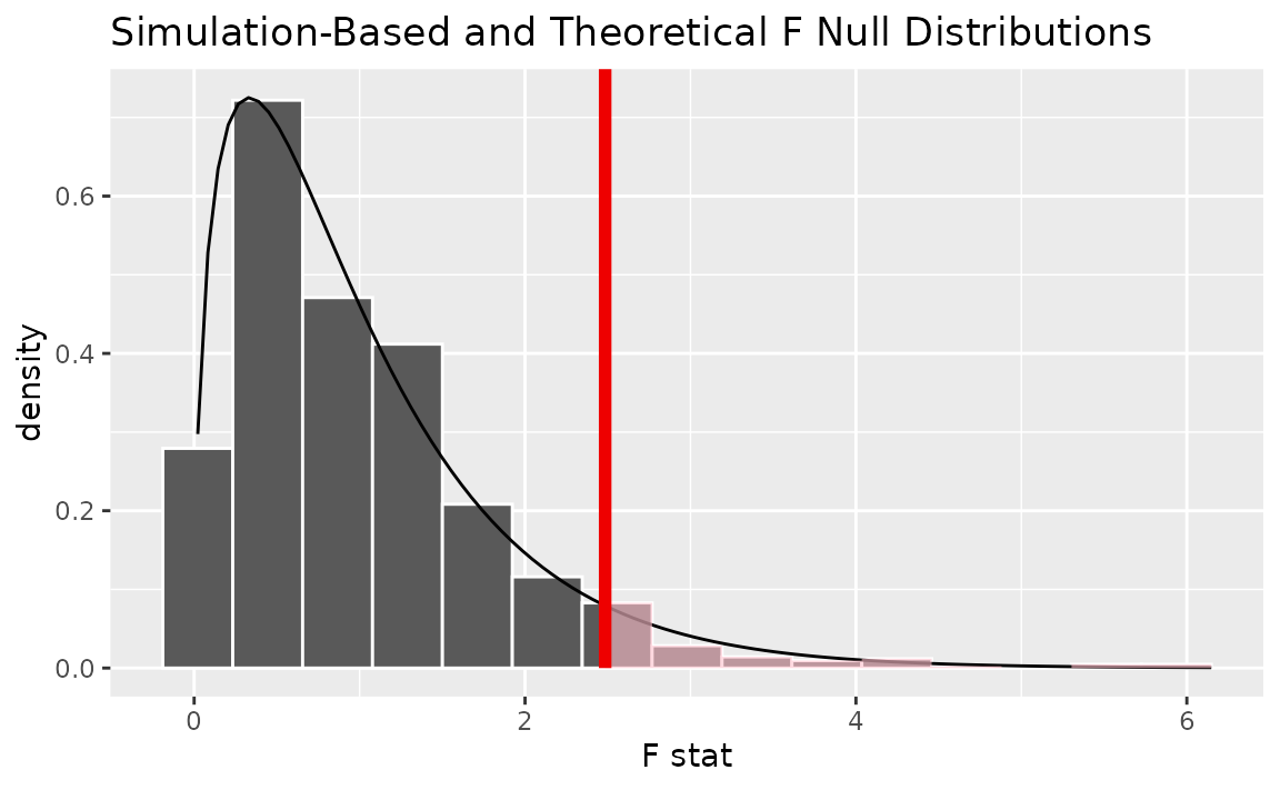
Either way, it looks like our observed test statistic would be quite unlikely if there were actually no association between age and political party affiliation. More exactly, we can approximate the p-value from the randomization-based approximation to the null distribution:
# calculate the p value from the observed statistic and null distribution
p_value <- null_dist |>
  get_p_value(obs_stat = observed_f_statistic,
              direction = "greater")

p_value
## # A tibble: 1 × 1
## p_value
## <dbl>
## 1 0.051Thus, if there were really no relationship between age and political party affiliation, our approximation of the probability that we would see a statistic as or more extreme than 2.4842 is approximately 0.051.
To calculate the p-value using the true
distribution, we can use the pf() function from base R.
This function allows us to situate the test statistic we calculated
previously in the
distribution with the appropriate degrees of freedom.
pf(observed_f_statistic$stat, 3, 496, lower.tail = FALSE)## [1] 0.06006Note that, while the observed statistic stays the same, the resulting p-value differs slightly between these two approaches since the randomization-based empirical distribution is an approximation of the true distribution.
The package currently does not supply a wrapper for tidy ANOVA tests.